Sunday 27 March 2011

JEAN PAUL GAULTIER


Jean Paul Gaultier links into the concept I have been researching of Sexual Orientation displaying women and men in a different format. All sexualities are explored throughout his advertisements as his flamboyant style and controversial character seeps through the body language of the models. All the images above reflect Lesbian, Heterosexual and Transvestite all separate aspects of Sexual orientation. I think this is good concept to have behind your work making it suitable for all genders and appeal to a wider variety of people.

EXPERIMENTING WITH DESIGNING BASED ON LACHAPELLE'S WORK...

These designs were inspired by David Lachapelle's work based on disability using the iconic figure that is "LADY GAGA" using props such as a wheelchair and crutches. I repeated the same design making minor changes with the media and shapes I used trying to make them different. I used ink,Biro and fine liner highlighting the main features and shapes of the garment.INK, BIRO AND FINE LINER
INK
FINE LINER
INK AND FINE LINER FINE LINERFINE LINER

I have managed to apply the same shapes but change them slightly by adding colour or adding structure to the design. I don't know how I would construct them but I could sample and experiment making it easier for my to get an idea of what my final design will look like.

DESIGN CYCLES USED IN THE FASHION INDUSTRY...

There are many ways in which you can apply the design cycle with the student; couture and high street way. The student design cycle consists of elements such as: Brief; Break down brief; Research; Sample; Designing; Evaluating; Toile; Shop for fabric; Manufacture plan;Make in final fabric; Present to customer and Evaluate. These are all the stages in which you apply to making a garment if your a student.
The second design cycle is appropriate for a Couture brand using fewer steps than the first design cycle but using the same methods just reducing the amount of time and effort in producing the same product.
The third design cycle is used by High street companies using the same steps as the first two design cycles encountering more staff into the equation making more time and pressure getting the clothes produced on time and seeing what the latest trends are on the street.I find that using the design cycle it organises the way you think and how you produce your final garment and if you logically apply the design cycle to your garment it will show through the work you produce.

Saturday 26 March 2011

MIND MAP.. WHAT A WAY TO THINK !

For this brief the way I have been displaying my ideas and concepts has been through the critical thinking method of MIND MAPPING.
For each of the elements of EQUALITY AND DIVERSITY I have researched deeper into RACE, DISABILITY, GENDER, SEXUAL ORIENTATION and AGE DISCRIMINATION to develop my knowledge on the concept.

EQUALITY AND DIVERSITY
DISABILITYRACESIZEISMBULLYING
This was a great way to brain storm all my ideas in a clear and coherent way using images as visuals to link to the concept.


Friday 25 March 2011

KATIE AND MY BEAUTIFUL FRIENDS...


The other night I watched a documentary called " Katie and my beautiful friends" as is all about people that have a disability and how they deal with it on a daily basis. Have you been watching it? Some of the stories are shocking and all you can feel is sympathy and you realise how lucky you are. I find it interesting looking at people's reactions on the street it's appalling how judgemental our society is and how people can classify these people as freaks when they are just human beings. These people have twice as much strength and courage that any other person has and if I was in their shoes I wouldn't be able to deal with it. I can't understand why people bully and intimidate people when it's not their fault, do they not realise that these people are aware of their deformities they don't need somebody to continuously remind them.Don't you just hate them people? In my opinion I think everybody is beautiful were all equal, because they have something physically different doesn't mean their not a nice person so why do British people judge people on what they look like they should learn to look deeper than just looks.What is beauty?

Tuesday 22 March 2011

CREATING AN ARM FACING

Following on from the previous post the same process applies to creating a arm facing but instead you use the armsyce and don't have to close any darts.
FINAL OUTCOME...


Overall, I found this process easier as I took on board the advice of leaving half of the excessive bulk so I had some to push over to the facing side so overall the arm facing was easier and worked better. I found this straight forward after the patterns were complete and find that sewing is the easiest aspect of facings whereas the patterns are difficult to get the correct shape and putting the right shoulders together.

GUIDE TO CREATE A NECK FACING

1. Get the front and back pieces.
2. Close the dart in the front shoulder seam and secure with masking tape.
3. Place both shoulder seam stitch lines together and secure with masking tape.
4. Draw a 5cm seam allowance all the way round the neckline and curve slightly.

5. Trace off the pattern and add the relevant information ( cut x1 on the fold in fabric and interfacing, name and grain line)
6. Cut pattern out.

FINAL OUTCOME...


Overall, I am pleased with my final outcome even though my learning curve for the day was to understand what would happen if you cut too much off whilst reducing bulk and I have learnt to not do it again as I cam across too many problems whilst creating the retaining row and the fraying of the fabric. It's juts too much effort! It still turned out well and I am impressed that I have learnt a new skill to apply to the dress we will make for the fashion show.


3.

Sunday 20 March 2011

GRAINLINE VS BIAS

Last pattern cutting lesson we made a dress cut on the grain line and a dress cut on the bias. The bias sample was very difficult to handle with cutting out and sewing making sure the speed I was going at was slow and controlled and made sure I didn't stretch the fabric. The difference between cutting on the bias and cutting on the grain line is that with cutting on the bias the outcome flares out more at the bottom and it fits nicer to the waist as it attaches itself to any empty space. My samples worked out well and I am very pleased with how they turned out and I prefer making the dress cut on the grain line but the dress cut on the bias seems to outline the silhouette more effectively.
Cut on the bias


Cut on the grain line


UNIT 7: DESIGN METHODS IN ART & DESIGN (new brief)

On Thursday we handed in our last unit and yet again began to start a new brief. This brief is based on designing for the college fashion show with the concept of equality & diversity, which is right up my street! We did a introductory task where we had a little go to apply shapes from an image to a blank model, so I chose the circular shape and accumulated the shape all the way down the arm ranging in size and angle of the shape. It's surprising what you can do in about 2 minutes! This exercise helped me to realise that you didn't have to design so obviously and the shapes in the final outcome didn't have to make the image but sections of it still resembled the theme.I feel confident with this brief as I think the theme we have been given can allow me to think outside the box and produce something interesting to go down the catwalk.

This was the shape I was given...
This is how I applied it to the body.

Thursday 17 March 2011

FROM RICHES TO RAGS


During this brief about advertising and creating a brand identity and making an impact on the public to invest in the brand and present themselves to a market level.This documentary I cam across is about Lily Allen and how she has changed her image from a pop star to a normal person with an ambition to open her own vintage shop. This was interesting as it revealed all the stages of beginning in the retailing industry and creating her own identity away from the image she had created in the music industry. The journey she followed creating music had been traded in for a new journey to sell clothes to people that can't afford expensive vintage clothing. Buying all the clothes herself and taking inspiration from a Beatles's song "Lucy in disguise" renting out an office built on top of sandwich shop she trades in fortune for a normal 9 to 5 job. Mary Portas guides her critically advises her about the market level as Lily has a specific target audience of a girl 20-30 years of age creating 3 different price ranges which are too high for a normal person to stretch towards. I will continue to follow this documentary and wonder if it will work out and if she accomplishes her dream ambition.

Wednesday 16 March 2011

EVALUATION OF UNIT 4: VISUAL COMMUNICATION THROUGH ART& DESIGN

The aim of this unit was to respond as a brand identity designer producing either packaging or an advertisement suiting the target market of what product we were given. We did many stages of research and experiments inspiring our designs for the product we were given making it send the right message and suit a specified customer. We then had to pitch our idea to a small group, as I would to my client trying to sell the product and finding different innovative ways to package the product so it would appeal to my target audience.

The first task of this unit was to research into a number of different brands ranging from food to clothing brands comparing and contrasting using the list that I had devised beforehand that would allow me to apply to critical thinking techniques. After doing my research I realised I had done too many brands but managed to get a diverse range of different brand identities making it easier for me to gain inspiration throughout the design development. I feel that I have managed to answer all these questions in my annotation explaining how media and materials were used and making this clear to get the pass criteria. After researching into the brands, I then had to recreate some of advertisements with various Medias such as: photo shop, collage and photographs. In this task I managed to collect a range of new skills and experiences I hadn’t yet attempted and believed I achieved a high standard in replicating the branded advert. If I were to do this task again I would use a range of aged models to recreate the adverts and research into less brands reducing the amount of time wasted.

In task 2 we had compare and contrast two different brands from my research and produce a 250 worded essay discussing their identities and messages. I found this task quite straight forward as I gathered a lot of researched on the websites, packaging, adverts and TV advert gaining a lot of knowledge on what the brand had to offer and what they represented. This made me learn more about the brand itself and helped me understand about what I would have to do to promote my brand identity for my product. Overall I feel that my essay discussed all the critical thinking questions and compared and contrast in depth about both of my chosen brands.

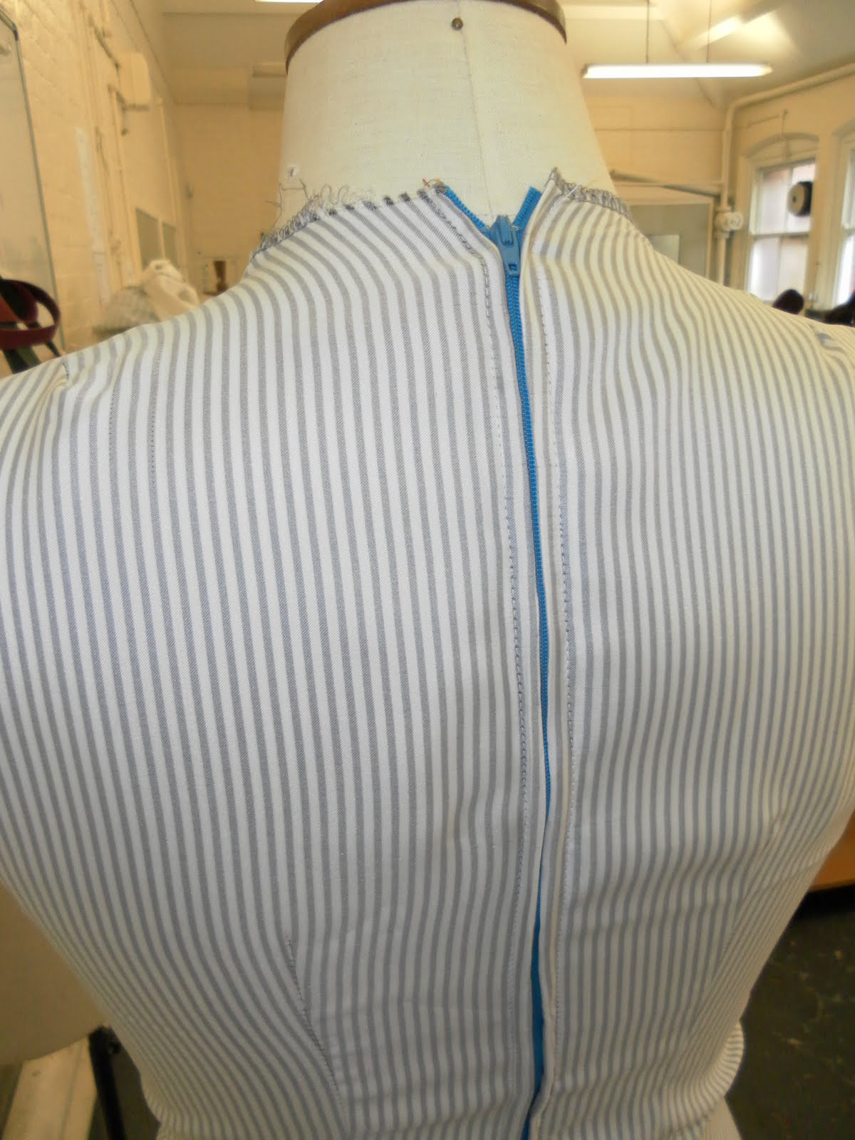
Task 3 was the most fun aspect of this brief allowing me to experiment with different materials and Medias seeing which colours, materials and techniques would work best to suit my specified target market. I extracted inspiration from Mulberry taking shapes and colours from the adverts and applying it to both 2d and 3 dimensionally structures seeing which size and shapes of bag or box I would like to base my design around. I also experimented with max factor and did numerous attempts using collage which overall worked out really well creating contrasting effects with the bright block colours layered on top of the deep black. This task helped me equip different skills to allow me to apply to my designs making it easier for me to challenge myself with my final design. This made me learn to really focus on things and take inspiration from props and settings used in the advert not just how its been laid out as it can create something innovative. I felt that I reached the aim of creating different messages changing the target market in each experiment seeing how they differed. Researching into the psychology of colour helped me gather a better understanding of what the colours would mean to gain the attention of the customer and relate to the intent of the product.

In task 4 we had to start designing but developing the designs so I chose to produce 4 packaging ideas for my product. I found this fairly easy as I had so much research to inspire me and I researched into bra advertising and packaging. First of all I experimented with bra advertising using my sister as the model and attempting to manipulate photographs using photo shop using the same colour scheme to see which one I would prefer doing. I sampled different font styles and background to see which one would suit the colour scheme and remain to promote the brand identity. I sampled different ways of which materials and medias I could use changing the function and style of packaging making it more advanced to suit a young and older target audience. I felt I experimented enough to really feel strongly about my final design as I was inspired by all my other designs to create the perfect packaging design that appeals to both young and older target audiences. If I were to improve on my packaging idea I would interpret my advertising experiments to suit a high street market making it appeal to wide range of people that could afford it. I felt I made it clear what product I was selling and designed it to appeal to me and I feel that it worked and would definitely be considered to suit my target market.

The final task was to pitch my idea to a small group and I felt that it went well and my peers gave me feedback to consider in the future and what I could do to improve my design. I made an inspiration board with visuals that could describe my character that I had made to make it clearer what my design had to do to sell the product. Overall I felt I described my work in depth and got my message across and related my product to the target market I was hoping for.

In conclusion I think this brief has made me consider other aspects of the fashion industry and made me experience skills I had never attempted before equipping me in future and making me more confident on using materials in and innovative way.

DIVE IN...


Is it me or are swimming caps slowly coming back into fashion? Swimming caps were manufactured in the 1920s made from latex produced using an aviator style chin straps allowing adjustments around the chin. The swim cap generation went scarce with the start of the war slowly coming slower making rubber materials harder to get hold of. This fashion was then only available to the wealthier women as they had to protect their "wave" hairstyle as it took time to obtain and was expensive so they wanted to protect it as long as possible. In the 1950s the swimming caps came back brighter and bolder than ever approaching the 60s trend of block colours flowered swimming caps were designed and available to all classes. From then onwards swimming caps were taken as fashion accessory to become a functional item used for the swimming sport after it had been established in 1980s improving their speed in the water. With me being a 21st century child I have been educated to know that swimming caps only were used for that purpose but researching into the history of swimming caps without fashion they wouldn't be around to help these athletes. I have been researching and found contemporary designers and brands that have been inspired by swimming caps to produce collection but to a high quality putting a flamboyant twist to the accessory. PPQ was one of them collaborating with Schweppes Abbey-Well ‘Get Britain Sch…wimming’ launched one off stylish swimming cap encouraging the public to swim regularly. The designs are made out of non waterproof materials so they wouldn't be of use in a swimming pool but nice to wear around making other people jealous! The innovative idea was influenced by the concept of British heritage producing four different looks that best signified British fashion. This consisted of the popular trends of Punk, 50′s Britain, Rockabilly and Royal all using the swim cap idea as the base of their products. Many other designers also made this trend more popular suiting different target audiences such as: Marni, Mui Mui and Marc Jacobs all relating it to their own style. I think this fashion trend will continue to be inspiration for designers giving them innovative ideas to play with and create such amazing pieces of art.