Sunday 27 February 2011

INSPIRED BY MULBERRY

One of the brands that I researched was Mulberry and decided to recreate their packaging logo and styles in which they advertised their brand. I recreated the same logo in different medias and materials to experiment with what I liked and also what didn't work so well. First of all I cut away from the brown paper to reveal the white background and in this instance I think I managed to secure an accurate shape and the contrast of both colours work well together. On the blog and website of this brand it uses the same colours but the reverse way round so I thought I would use the same colours to allow it to suit to the same target audience but change it to see what it would look like. This technique creates the same mellow mood shared in the advertisements with the neutral colours. I adapted it by using different colours as the background and layering paint on top to create different textures and colour contrasts. I also used it as a stencil and printed the design on both fabric and paper to see the difference in properties and texture using the right and opposing side of the stencil creating a different pattern. I made a bag to sample the design on to alternate it from 2d form into a 3d form to see if it would work and I think I have been able to create a nice effect and would definitely use this technique in my design if the shape of my product is a suitable shape and size.
Another idea I picked out from Mulberry's research was the handbag features form the products advertised in the advertisements and extracted the straps and logo and replicated it using various me
dias and techniques to see which sample I preferred and would like to use in my designing process.Firstly I started out with a pencil draft on the 3d form of a bag and though of different ways I could change it to make it suit a different target audience of a high street, couture and ready to wear market level. Similar to the other sample I used a cutting out method to reveal the underneath layer and though it would look good for bulky packaging if I layered up different fabrics and paper to make it stand out to a couture market level as it takes a lot of time and effort to make it more personal. I think this technique worked well but I could have improved it by adding colour to make it youthful and energetic like the Mulberry advertising. Other medias I used was masking tape and Biro to highlight the features with two contrasting colours to get an idea of colour schemes would work taken from shades used in advert sing of the props using bold colours. If I were to improve it I could merge all the techniques together to create different textures and patterns revealing other colours over and under the features. The last media I used was a collage of different textures and colours to uplift the main features of the handbag. This worked very well but I could reduce the amount of texture and print it on the bag but have selected sections that are touchable... similar to a baby's book educating them in animals by making it TOUCHY FEELY.

PRIMARY RESEARCH

GET IT. GRAB IT. TAKE IT.
We collect and get given packaging everyday for to make our purchases appeal and stand out to us. Whether it's your local cafe on the corner or a worldwide branded coffee company they all make the effort and compete to impress the customers by the detail of the packaging. What's the difference? Well all women appeal to detail and cute pretty things and they know the difference between printed gift wrapping, scented paper and ribbon and just a plain plastic bag, the winner is easily decided! We all fall for it though, don't we? I have been gathering a selection of different bags and packaging from different high street shops using different medias to recreate and sample but to use as evidence to be able to get ideas from for my designing process. I have tried to recreate the nets of this packaging and drafted patterns to make use of whilst designing but have adapted to make it more innovative. How many people throw away fliers and leaflets? We all do it! In this case they came in good use to place in my sketchbook and provide inspiration for future design extracting the colour scheme, shapes and ideas. It's not much harm to actually read what the brand is about is it?


THE COLOUR OF MISSONI

For my research I have been looking at contemporary brand identities and thought I would research into a historical brand to see how much their brand identity has developed throughout the eras.The Missoni style is always determined by colour and it usually the main focus of the advertising as it provides happiness and elegance.Often the brand suits a ready to wear/ couture market level but in previous years it has been available to high street consumers suiting a sport related lifestyle.The brand is suited to a sophisticated and older target audience as the patterns are old fashioned and reflect a vintage style. The company was founded in 1953 but has never changed their appeal in clothing to suit a contemporary audience as the designers have kept the patterns and concepts consistent and that's what makes the brand so unique! However, the advertising has changed using a variety of methods to suit different target audiences still maintaining a historical feel and look. The distinctive pattern which we know the brand by is either multi coloured stripes or zig zags that merge contrasting and complementary colours together. The first stripes that were created by Missoni were manufactured by machines that were originally used for making tracksuits and it was only programmed to produce stripes in solid colours or stripes. Recently the brand has expanded to producing packaging and accessories to high street brands allowing different target audience to buy into the brand and get a taste of the lifestyle that Missoni offers.


Saturday 26 February 2011

WHO'S LOOKING BACK AT YOU?

What makes us want to buy into a brand? How are we inspired to purchase something that we don't desperately need but just like the look of? Easy answer is that we are surrounded by brands: logos; packaging; billboards consecutively reminding us how our lives can change for the better if we buy their products. Reflections in front, behind and at the side of you as you stare at a window display spotting a new shop to visit by the bags they are holding but the problem is you don't know where the shop is! Why are people so happy to carry around a Chanel bag but ashamed to be seen supporting Primark.
What's the difference?
They both sell clothes, that's the important thing but people are too proud nowadays and believe they have to fit into a lifestyle of a celebrity.I've been through the stage of buying something cheap at a shop just to get the bag and grown out of it, but to be honest we all experience desperation at a point in our lives but what makes us?
I like the fact that I can't afford such expensive garments because it allows me to appreciate fashion as I know it and what is available to me. Remember we are all WALKING ADVERTISEMENTS...


Tuesday 22 February 2011

PUTTING A GATHERING STRIP IN THE BACK BODICE


Remember the other posts about gathering a sleeve head and shoulder seam well putting a gathering strip in the back bodice was the final stage of completing a perfect gathering sample. I found this the hardest part of all three sessions because I had to make sure I didn't catch the gathering strip in the bodice and make sure that I sewed neatly and made sure that all the parts were eased into place. Overall, I am happy with the final outcome as the gathering strip turned out very neat and sewing all the sleeve head, back bodice and shoulder seam was successful.It could be improved by making the over locking neater at the neck line and using a nicer fabric to do the sleeve head with.
What do you think, would you try it?

VIKTOR & ROLF vs ADIDAS

In the criteria for the unit VISUAL COMMUNICATION THROUGH ART & DESIGN it states that we must write a 250 word written piece comparing and contrasting two brands within the fashion industry. I changed my decision so many times because there are so many different brands with contrasting brand identities that I could have chosen but the target audiences for both these brands were opposites but they shared similar aspects with in advertising.

Obviously being me I couldn't keep to the limit of 250 words and went over by a a lot but I managed to get everything in that I wanted
to.I don't think anybody takes count of the words they use, do they?

Do we all aspire to live the lifestyle of a rock star?

The two brands I am going to compare and contrast in this essay are Viktor& Rolf and Adidas developing my knowledge on all elements of advertising and how these brand display and advertise their brand identity. I will look at the target audience, colours scheme, method of advertising they use, USP of their product, message behind the advertisement and mood in which is created in the advertisement.

VIKTOR & ROLF'S WEBSITE HOMEPAGE

VIKTOR & ROLF'S PACKAGING

FLOWER BOMB

EAU MEGA

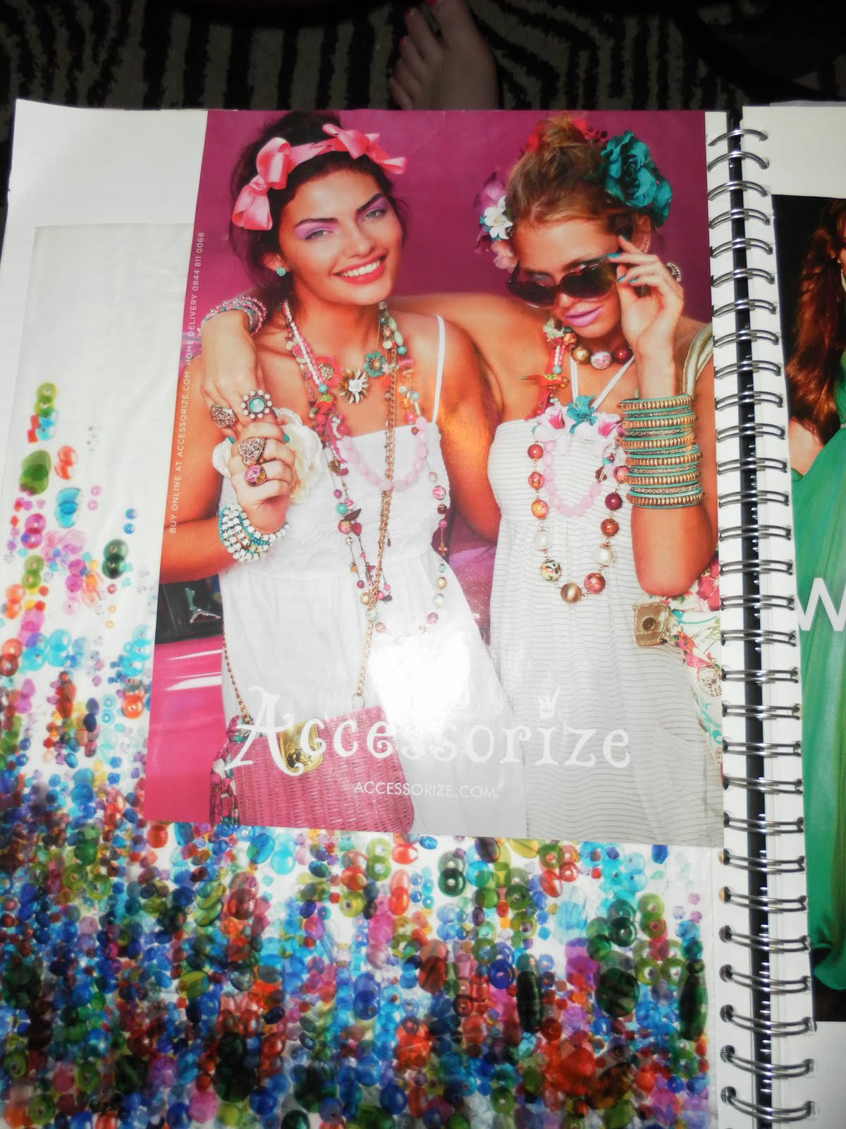
ADIDAS WEBSITE HOMEPAGE

MAGAZINE ADVERT - PARTY

MAGAZINE/ BILLBOARD ADVERT- ATHLETISM

Both these brands have similarities as they share the same area of fashion of constructing garments so their brands appeal to all audiences but it depends on whether people just admire their products or can actually afford them. They both use innovative styles and themes throughout their advertising experimenting with aiming their brand at different target audiences depending on the trend analysis. Furthermore, they both have an affordable label that can be purchased by any target audience or lifestyle. Moreover, they promote their brands through the catwalk to allow the audience to preview their products in a conceptual manner. The difference between the way they present their garment son the runway is that Adidas accompanies other brands to complete the collection whereas, Viktor & Rolf have a fashion show based on just their brand identity. Adidas don’t host a catwalk for just their clothes because their target audience isn’t usually aimed at such a high level but has extended their brand identity to be better known throughout different market levels throughout the industry.

Viktor & Rolf is suited to a Couture/ Ready to wear market level and aimed at an older target audience evidently shown by the innovative advertising and exquisite tailoring used to construct their garments. The colour scheme used in Viktor & Rolf is a variation of different shades and tones from a neutral colour palette. The light pink provides the meaning of love and romance and white symbolises purity creating an impression that the product is expensive and one of a kind. This provides innocence to the brand identity suited to a feminine woman. Using the method of comparative juxtaposition the brand advertises with contrasting colour of white and black providing power and authority to the garment sending a message to the audience that women are just as equal as men in strength. The website is structured maintaining continuity of these colours targeting a specific target audience and lifestyle. The USP of this brand is the investment of a quality product and the personalised packaging and innovative ideas of boxes and bags allowing the audience to feel like they have experienced the lifestyle in which Viktor & Rolf have to offer. Similarly on the website and their presence on the runway they tell a story and create an adventure for the audience to experience online but also up close giving the audience an insight of their visionary. Both perfumes Flower Bomb and Eau Mega have separate target audiences with Flower Bomb suited to a relaxed and a natural lifestyle creating a soft and happy mood through the natural form of the model without any props or clothing creating an impression that the essence and aroma is extracted from a rural surrounding. Whereas, Eau Mega uses the method of exaggeration in the advert to enlarge the model making her look as if she is high in authority as the image is enhanced suited to a more mature sophisticated lifestyle creating a calm and relaxing mood and atmosphere. All of their perfume adverts are popularly used in fashion magazines and they use the same advert of both these perfumes and haven’t developed on the perfumes to release different editions like the high street do creating an impression that they don’t need to as people buy into the brand.

In comparison Adidas is aimed at a younger target audience and a High street market level using a bright intense colour scheme to allow the products to stand out in Vogue and Elle magazine as it will contrast to all the couture and Ready to wear brands. The continuity of blue and white features in Adidas’s packaging or garment ideas. Blue signifies restful and calm complementing the meaning behind white which is purity both supplying the brand identity with an optimistic image. Adidas is used to sponsor sports events and matches but in return it advertises the brand suited to a sporty lifestyle. Compared to Viktor & Rolf’s website there is a lot more information and the web design is standard and suited to an audience of any age. Whereas, the website for Viktor & Rolf is customised to the brand identity with specific shapes and navigationally formatted in an innovative way with minimal content but more visual information. Adidas has advertised their brand identity through many different methods of: Accumulation; comedy and celebrity endorsements giving the audience an impression that they can live within a different lifestyle whilst wearing their brand. The inspiration for the advertising if often a lifestyle of partying or sport conveying a happy and exciting mood and atmosphere making the brand’s products something positive to invest in. Similar to Viktor & Rolf they share the same USP of buying into the brand to fit in with a lifestyle as Viktor and Rolf exposes authority and confidence whereas Adidas reveals a fun and joyful lifestyle because of the facial expressions shown in the advertisements. The packaging of Adidas uses the blue and white colour scheme and prints their logo on all additional packaging of swing tags and bags. Similar to Adidas Viktor & Rolf uses the same packaging methods but structures an innovative packing idea to suit each target audience.

In conclusion both of these brands are successful at advertising and both create an impact and start trends appealing to different target audiences. They both share the same quality in packaging as they aim their products at a higher target market and have to present their products in a creative way. Both brands present their brand in an eye catching way on billboards and magazines but Viktor & Rolf’s advertising is less common as their brand identity is usually advertised in different ways to Adidas. The brand most suited to me is Adidas because of the price and the availability of it even though I admire Viktor & Rolf’s clothes and products it is impossible for me to own any of their clothes or perfumes. In my opinion many people would save or have an option to spend a lot of money on Viktor & Rolf’s brand identity but I think Adidas will continue to become more popular as it has expanded into a worldwide brand and can be available and affordable to anybody of any age or gender. What do you think?


Monday 21 February 2011

WHAT I THINK ABOUT THE NEW ASSIGNMENT...

This new assignment entitled COMMUNICATION THROUGH ART & DESIGN is all based on advertising and experimenting with different medias and materials to promote a product suited to a specific target audience. My first thought on this assignment was it's going to be hard and it's taking me a while to completely get into the unit and enjoy producing work. Honestly, it's not what I enjoy doing but I have found it useful to give me an insight of a different element within the fashion industry. Hopefully I should be able to produce something that resembles my personality but still maintains a suitable target audience. I will make sure I will keep you updated for any further developments of this unit.

EXPERIMENTING WITH DIFFERENT MEDIAS AND MATERIALS

For this assignment task 3 was to experiment with different medias and materials and compare to other advertising methods. The main ways of advertising I came across consisted of photo shop and photographs so it was quite challenging to replicate the images so I tried different angles and shots until I got a refined image. Even though I attempted these different adverts there is still room for improvement but I will never get an exact replicate but I can try to achieve a close enough copy.
MAX FACTOR
In this attempt I used a photograph and collaged the font on top of the products trying to create layers similar to the advert.Compared to this advert I think my attempt is similar but could be improved by using photo shop to insert the text to make it look more professional to suit a high street market level and young target audience.Overall I have found similar c
olours and used the same positions and shapes so I think I have replicated this advert very well for my first attempt. Do you have any thoughts or ideas how I could improve?

MULBERRY
In this attempt I thought that the overall image was too challe
nging to replicate so I extracted the colour scheme to use for future reference in case I wanted to use it for my advertising campaign or packaging idea. In my opinion I think the colours are fairly accurate but to improve I could have zoomed in to different sections of the photograph and replicate either the design or structure of the garments to change into a 2d or 3d format.
In this simplistic image I attempted to replicate this advert as it was easier to reproduce. Overall I am happy with the outcome but I bet your all wondering that she looks nothing like the model but it was the closest I could get to this advert.I tried to find accessories and garments that I owned that could create a similar image and they worked well together but I could have edited this original photograph in photo shop to make it look similar
to the model.
ACCESSORIZE

In this attempt I think I have made a good effort to recreate this advert using the same colours, shapes and patterns and allowed my sister and her friend to pose in a similar manner to the model's in this advert. I could improve by analysing the advert closely and using the exact colour scheme to make it look similar and use older models or edited it in photo shop to make it look more professional.
JEAN PAUL GAULTIER
In this attempt I took a photo graph and edited it in photo shop and found it rather difficult to get the right contrast and tone in the background and after so much effort I still didn't get a precise colour but got a close attempt. I added more detail on top of the photo graph of the logo and perfume bottle to give it a 3 dimensional look by collaging the exact font to make it look more like the MADAME advert.What do you think about these outcomes or do you think they could be improved?