After coming back from the Christmas holiday, I have realised I have been really lazy and not done a lot on my blog for a while so thought I should get back to writing. Term started today and I started the day by learning to knit with a domestic machine. Not going to lie thought it would be quite simple to hop onto and get in the mood but it was far from it. I started picking out the wrong yarn that was too light or kept splitting so I had to restart, when I wasn't happy about. I learnt how to cast on and change the tension and change the colour way. I do feel like it was challenging but I feel like I have accomplished something and broken my fear of the machines, which is positive I suppose.
For the final task of my brief I have to create 10 final print samples that showcase my chosen concept. My samples are varied within pigment printing, transfer printing and polychromatic printing. I have kept to the same colour scheme but tried to experiment with different ways I can see my prints and in which printing technique the exposed print works best. Out of all the printing techniques I have like the finish of Pigment printing the best but layers of all three techniques we have learnt can created some of the most interesting textures in print.
This week I created a window display for GP Studios, London. I have been organising this window display for quite some time now and finally the time has arrived that I can see part of my collection in a different place other than my wardrobe at home. GP Studios does a lot for high street companies creating on installations and window displays, so it's great to work with a different group of people.
Hopefully it attracts people to the company and lets people in London see my designs and work.
Yesterday, I attended a workshop that was modelling on the stand for the purpose of allowing us Textile designers to understand the way in which we place the print onto the body. With print as a textile element, you have to simplify the shape of the garment to let the print do the work. We worked in pairs and pinned the fabric onto the body, that if we took off we could create a pattern from. Me and my partner started of quite complex and began to simplify the drape as we went along taking a pin out at a time and seeing how it would look. I think overall we produced some really good interesting shapes that I would be happy to create with a print design.
Which one is your favourite?
As part of our assessment evidence we took part in a Creative Catalyst workshop where we created compositions of colour that would relate to our final colour palette. We had the task of collecting a variety of different collectives and textures within a similar colour scheme and apply them to a surface in certain format. I found this workshop extremely inspiring as I don't often use colour within my work, but seeing colours together that you wouldn't expect has allowed me to accept colour within my print work. This would be quite interesting to see on a colour board demonstrating images and objects that showcase the colour that has inspired your palette. If you do struggle with colour and laying out a format of creative objects I would definitely recommend this methodology, as it is practical way of understanding your colour palette.


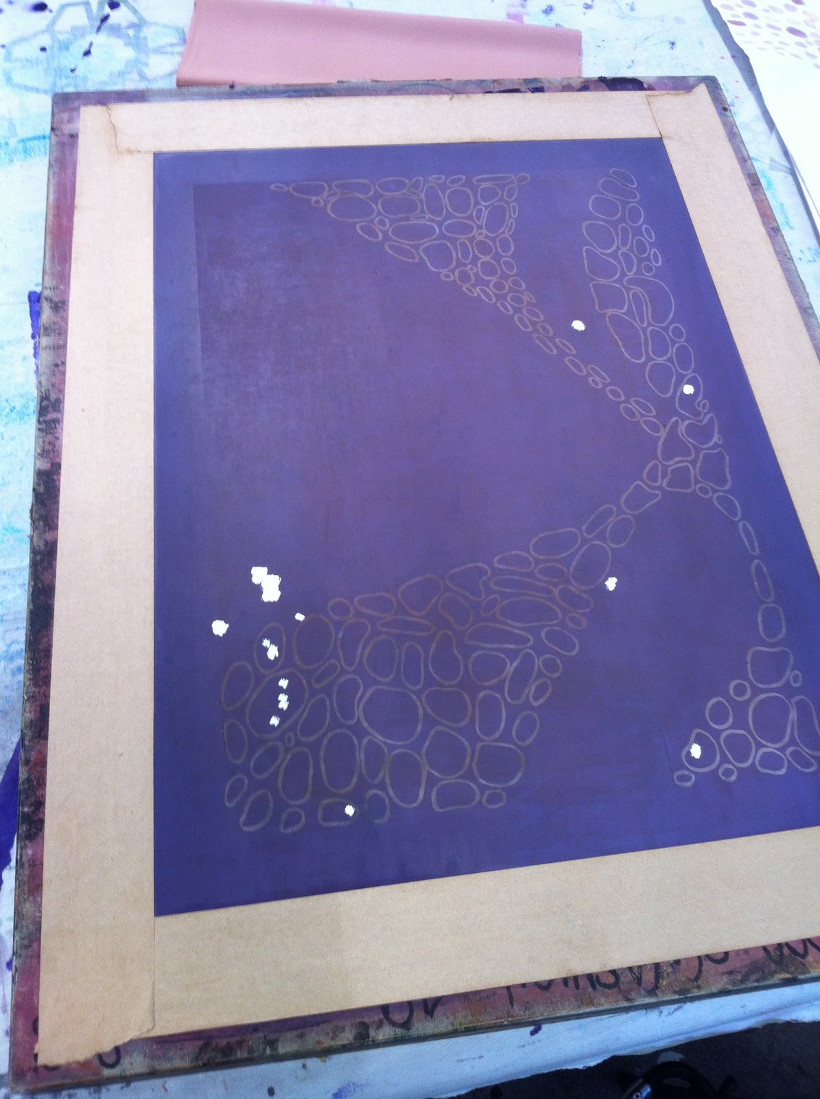
Today we finally started work using the stencil artwork on the screens. I prepared my Tracing paper stencil in advance, which was based on contemporary architecture. I extracted shapes and patterns from a variation of different contemporaries and combined them altogether to create this symmetrical artwork. I found that this technique worked really well for this design as it bought out all the intricate details whilst contrasting to the blocks of colour. The colours I mixed were a good match to my colour scheme, even though the first attempt on Calico came out rather stronger than I hoped.The white Silk diluted the colour, to give it a weaker colour, which linked in with my colour scheme. Even though, this process is quite time consuming, I find that it the most appropriate for accurate drawings and precise measurements as it is copying everything you put to paper. Unlike the Transfer and Sublimation techniques, they are quite loose and hard to control, which makes it difficult for you to get straight and accurate lines. I think for my final samples, I will definitely use this process and make it more complex, as I know this way works for the shapes I am thinking of creating.
What do you think?
I am trying to get as many people to vote for my Capsule collection for Vogue Muuse. I entered the competition and thought I would see how many votes I can get. If you get a spare moment just go to muuse.com/voguevote and look for EMILY JACKSON and then 'Vote' and it will send you a confirmation email, to your address, confirm it and you have voted. I would really appreciate it if you could help me with this.
Thank you.