


Today we finally started work using the stencil artwork on the screens. I prepared my Tracing paper stencil in advance, which was based on contemporary architecture. I extracted shapes and patterns from a variation of different contemporaries and combined them altogether to create this symmetrical artwork. I found that this technique worked really well for this design as it bought out all the intricate details whilst contrasting to the blocks of colour. The colours I mixed were a good match to my colour scheme, even though the first attempt on Calico came out rather stronger than I hoped.The white Silk diluted the colour, to give it a weaker colour, which linked in with my colour scheme. Even though, this process is quite time consuming, I find that it the most appropriate for accurate drawings and precise measurements as it is copying everything you put to paper. Unlike the Transfer and Sublimation techniques, they are quite loose and hard to control, which makes it difficult for you to get straight and accurate lines. I think for my final samples, I will definitely use this process and make it more complex, as I know this way works for the shapes I am thinking of creating.
What do you think?
I am trying to get as many people to vote for my Capsule collection for Vogue Muuse. I entered the competition and thought I would see how many votes I can get. If you get a spare moment just go to muuse.com/voguevote and look for EMILY JACKSON and then 'Vote' and it will send you a confirmation email, to your address, confirm it and you have voted. I would really appreciate it if you could help me with this.
Thank you.
 So it is getting serious now.. University has officlaly started with the dreaded essay. I have to write an essay on an object/ image and relate it to a quote by "Vanessa Steele", Fashion Theory. In which case, I have chosen to relate my essay to My Grandad's Soldiers Service and Pay Book, from the Second World War. I have chosen this object as it relates to me and someone that I was close to and provides me the opportunity to get to understand his achievements in the army. I found some information on the Military uniform and the book itself. I also took pictures of tanks and the information on the tanks from that period, as I knew that he was related to TANKS in some way. At the moment they have an exhibition on "CECIL BEATON", if you are personally interested in War photography.
I would recommend this to the public that like to explore the past in war.
Go explore...
So it is getting serious now.. University has officlaly started with the dreaded essay. I have to write an essay on an object/ image and relate it to a quote by "Vanessa Steele", Fashion Theory. In which case, I have chosen to relate my essay to My Grandad's Soldiers Service and Pay Book, from the Second World War. I have chosen this object as it relates to me and someone that I was close to and provides me the opportunity to get to understand his achievements in the army. I found some information on the Military uniform and the book itself. I also took pictures of tanks and the information on the tanks from that period, as I knew that he was related to TANKS in some way. At the moment they have an exhibition on "CECIL BEATON", if you are personally interested in War photography.
I would recommend this to the public that like to explore the past in war.
Go explore...
Recently I took part in a fashion show where my garments for my a/w 2012 capsule collection were showcased in front of an audience. I only sent down 3 of my complete outfits as the BIG move to London proved difficulty in transporting the garments from Cheshire. It was nice to see them in a different venue and worn by different models. I am pleased with how the show went and thoroughly enjoyed myself, whilst meeting a nice selection of people in the creative arts.
I would give 10/10 for this event and would consider any designer to attend and showcase their collections.
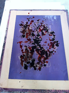
The first workshop within print I attended was TRANSFER PRINTING. This consisted of created drawings with sublimation inks on newsprint paper, so that when the heat from the heat press secures the drawing it transfers onto the plain fabric. I found this technique quite easy to get the hang of and showed variety of different drawings in different colours taken from my architecture research. Some of my attempts didn't really work and personally I didn't like them as much when they were transferred, as they were too bright. My favourites were the black and white samples and the brown samples. I would consider this technique to be quite fun and enjoyable and would be suited for more expressive illustrations; rather than intricate and technical.
Have a go!


 So it is getting serious now.. University has officlaly started with the dreaded essay. I have to write an essay on an object/ image and relate it to a quote by "Vanessa Steele", Fashion Theory. In which case, I have chosen to relate my essay to My Grandad's Soldiers Service and Pay Book, from the Second World War. I have chosen this object as it relates to me and someone that I was close to and provides me the opportunity to get to understand his achievements in the army. I found some information on the Military uniform and the book itself. I also took pictures of tanks and the information on the tanks from that period, as I knew that he was related to TANKS in some way. At the moment they have an exhibition on "CECIL BEATON", if you are personally interested in War photography.


