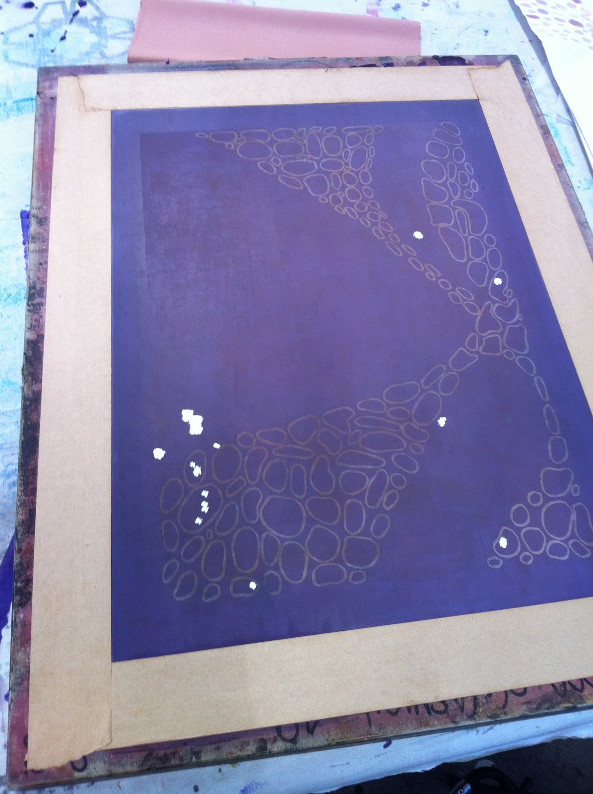
For the final task of my brief I have to create 10 final print samples that showcase my chosen concept. My samples are varied within pigment printing, transfer printing and polychromatic printing. I have kept to the same colour scheme but tried to experiment with different ways I can see my prints and in which printing technique the exposed print works best. Out of all the printing techniques I have like the finish of Pigment printing the best but layers of all three techniques we have learnt can created some of the most interesting textures in print.
This week I created a window display for GP Studios, London. I have been organising this window display for quite some time now and finally the time has arrived that I can see part of my collection in a different place other than my wardrobe at home. GP Studios does a lot for high street companies creating on installations and window displays, so it's great to work with a different group of people.
Hopefully it attracts people to the company and lets people in London see my designs and work.
Yesterday, I attended a workshop that was modelling on the stand for the purpose of allowing us Textile designers to understand the way in which we place the print onto the body. With print as a textile element, you have to simplify the shape of the garment to let the print do the work. We worked in pairs and pinned the fabric onto the body, that if we took off we could create a pattern from. Me and my partner started of quite complex and began to simplify the drape as we went along taking a pin out at a time and seeing how it would look. I think overall we produced some really good interesting shapes that I would be happy to create with a print design.
Which one is your favourite?
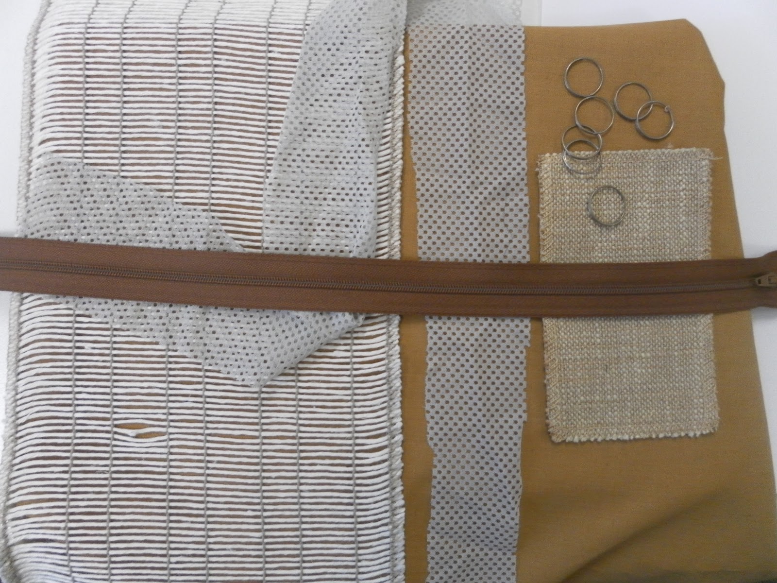
As part of our assessment evidence we took part in a Creative Catalyst workshop where we created compositions of colour that would relate to our final colour palette. We had the task of collecting a variety of different collectives and textures within a similar colour scheme and apply them to a surface in certain format. I found this workshop extremely inspiring as I don't often use colour within my work, but seeing colours together that you wouldn't expect has allowed me to accept colour within my print work. This would be quite interesting to see on a colour board demonstrating images and objects that showcase the colour that has inspired your palette. If you do struggle with colour and laying out a format of creative objects I would definitely recommend this methodology, as it is practical way of understanding your colour palette.