Wednesday, 28 December 2011

LEGGINGS PROGRESS...

I'm finally getting there with my leggings, I only have a few more shapes to sew on now. Hopefully I should have completed them in a couple of weeks, when I get back to college. I have now resorted to hand sewing them on due to how I am finding using the machine too difficult and fiddly. I still find it difficult to hand sew the shapes on but I think it is a little bit more easier. Can you see the progress?

CONCEPT BOARD FOR ILLUSTRATION BRIEF...

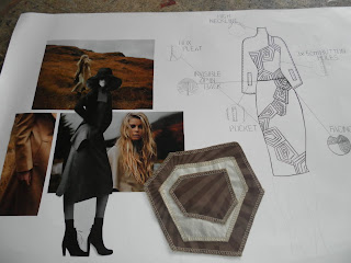
To complete the last task on the illustration unit we had to construct a concept boards that reflected what inspiration we had taken from illustrator's work we had researched.I decided to use a lot of influences from Howard Tangye's work so I encouraged his style of work into my concept board and used appropriate images that I was most inspired by. I used collage to display my images so it would work with the rest of my boards. Overall, I feel my concept board is strong and strongly shows what I have been inspired by and what my style has become and which pathway I want to go with my drawing.

Friday, 16 December 2011

FINAL ILLUSTRATION BOARD...

Today I managed to accomplish my goal of completing the last of my illustration boards as I was a bit indecisive on what I thought about it as her head was very big but I might alter it by adding a little bit more tone on the face to define the features rather than makes the head look really big. I am pleased with this pair of boards and am pleased with how they turned out but I might give them a little bit more tone in time. I enjoyed completing these boards rather than the two I did previously as I think I prefer close up images rather than distant angles. I think all the boards work together effectively as they all bring through the same medium and inspiration. What do you think?

Thursday, 15 December 2011

FINDING THE RIGHT MODEL FOR MY LEGGINGS...

I allowed some students to try on my leggings to filter through the different body types in which this case I realised I needed a tall model with a athletic figure that would pull off these leggings professionally. I think they look very striking on a real life model and fit accurately so I am pleased with how the fitting has gone so far!

LAY PLANS FOR MY LEGGINGS...

As part of my functional skills criteria for the day I had to attempt to create a lay plan for my leggings creating a different lay plan for three fabrics. I started by measuring the paper to what width and meters needed I needed and started to place my patterns in the most confined spacing to reduce wastage. I completed two and still have one to complete but I shall complete that soon. I found this task a little bit confusing because I got mixed up with how I positioned the pieces so I learned from that mistake and hopefully won't make that mistake again. I also completed a costing sheet which allowed me to work out how much I actually needed not what I thought I needed.

ILLUSTRATION BOARD NUMBER THREE...

As I have now completed 2 sets of A2 illustration boards I am now on the final two boards and I have decided to go with the close up angles as they allow me to be more creative with my work. I used similar techniques of ink, fine liner and collage as these techniques have inspired me the most from my illustrator's research. I still need to add to it so I will upload the finished product so you can see if it makes a difference. I like how I have bought through the charcoal to combine the last two sets together with this set. Hopefully the other board will be successful!

Friday, 9 December 2011

MOVING ON TO FINAL LEGGINGS... WITH PVC

As you have probably guessed I have completed my Toile now for my leggings and can now create my final pair of crazy leggings. I was impressed with myself today as I over locked the notches so they were more accurate and matched correctly. I had a few problems with attaching the PVC to the shell of the leggings but I was expecting that so had to fiddle about with it to reduce the ugliness of it. First of all, I had to sew all the individual pieces together inside each other close to edge in same coloured threads to then tack onto leggings whilst on mannequin to then sew and provide equal pressure to reduce amount of bubbles under the fabric. The first few have gone well but there have been a few problem areas that I didn't know would happen but they aren't that visible.

SECOND SET OF ILLUSTRATION BOARDS...

I struggled with creating these as I preferred close up but wanted to show variation with a full length image but it didn't make my life easy. In the end I decided to scrap the face as it wasn't working and use a method which one of my illustrator's - Tobie Giddio by just outlining the face and shadowing it to creating motion in the illustration to make it seem finished rather than unfinished. I also bought through elements of Origami as I liked Jonathan Looman's use of paper folding and using textiles to create the detail inspired by Ernest Dryden. I think this has made me definitely decide to create two other boards that are close up as I could apply my drawing skills to them easier. Do you like them?

FIRST SET OF ILLUSTRATION BOARDS...

To strengthen our portfolios for interview we have been set the challenge of creating 6 illustration boards, 2 design boards and a concept board. For my first set I was especially inspired by Howard Tangye's work using the form of colour to emphasise certain features and used ink in a similar way he would in his work. I was also inspired by colour schemes that he had used and colours from the capsule collection I had created so it would suit my specific target customer. Breaking down the preparation for this to become a success I had to find two close up shots that would work together and experiment with different techniques to see which one I preferred and had to evidence where I had sourced the inspiration from and what design I was trying to illustrate. For the second board I decided to bring through other influences of Jonathan Looman and collage techniques but keep similar structures of the face and colour within the features. I was very surprised at how well these turned out and was really proud of these as they suit my style and suit my target customer. Which is your favourite?

Saturday, 3 December 2011

GOT TO LOVE A BIT OF WILLIAM TEMPEST...

Yesterday we were joined by fashion royalty that is William Tempest to talk to us about the realism of fashion. I had the great honour of having a 1:1 talk to him about my work and how he thought I got strengthen my portfolio for university and as a designer. He bought in a few examples from his collections which was an eye opener to see the crisp lines and finishes of the garments and it was nice to see how passionate he was for fashion. He gave me some phrase but also improvements that I need to consider for interviews at university so overall I found the day productive and got a lot from it.

NEW, REFINED DESIGNS...

For this brief, I had to illustrate my designs in a way that was detailed and technical improving the last versions and developing them so they were a suitable standard for interview. I liked my originals because it suits my style and personality but I can understand the construction of these garments now they have the rest of the information on. I think I would improve it by selecting a few to go into more detail with making them appear more stronger. I have managed to incorporate all the stitch and seam lines so the manufacturer would be clear on what they have to produce rather than the vague image that was coming through from the first attempts. Which one is your favourite?

Saturday, 26 November 2011

TRICKY PART - THE APPLIQUE...

After completing my leggings and the base to my design I then moved onto attempting to sew on the appliqued shapes in the neatest way possible. The first attempt with just pinning it to the leggings didn't work as it bubbled up giving it an unprofessional effect. Then I tack stitched the shapes on prior to sewing and then sewed over them and they sewed on neater and flatter giving a crisper finish. Now I feel confident with this design working but still need to make sure the PVC will work and sew on properly so will have to sample that before starting my final attempt.

CREATING CUFFS FOR MY LEGGINGS...

The same way I created the waist band I also created some cuffs to finish off the bottom trouser which in this case turned out quite nicely and were simple to construct. The only problem I could have would be that the leggings are extra long so if they don't fit the model I would have to turn up the leggings and re fit the cuffs to fit the new length. Like them?

CREATING A WAIST BAND FOR MY LEGGINGS...

In yesterday's pattern cutting lesson I managed to finish my leggings with a waistband and cuffs. This was a simple process as I had to fold over the pattern and pin to waist or lower leg and over lock to fabric. I found this quite easy to follow but I need to improve my technique whilst matching notches because I found that the stretch fabric moved and the notches didn't match up. I felt that the waistband work very well and fitted exactly so I was pleased with this method.

Wednesday, 23 November 2011

CREATING A DESIGN WITH MY OWN TEMPLATE...

For today's task we have had to create a template by merging poses and facial expressions we like together and trace off to create a full figure. I had to two attempt and chose the best outcome to then sketch over it my design from the last brief. I then added colour and focused in on features and areas that might need sampling and how it will function. At the start of this task I was getting a bit frustrated as I couldn't draw it free hand but then the computer made it much easier to cope with. I then started to enjoy the experimenting and knowing that I have created the template myself.

Saturday, 19 November 2011

2 DESIGN SHEETS COMPLETE JUST 4 MORE TO GO...
I have already posted one of my design sheets up but now it's complete so you can see how more I have added to it. The first design sheet is based on a trousers and top outfit that uses inserts so I had to focus on stitches, zips, inserts, waist bands, button holes. Then I did another one which was a cape, top and skirt and had to deconstruct the features to see how I would sample and make it and what fabrics I would use. I am pleased with these now so they can go in my portfolio for interview for universities.
What do you guys think?

STARTING MY TOILE...

In the end I went with a flesh coloured Lycra from www.fabricland.co.uk
which was £5-99 a metre so was ideal to use for a Toile and the final leggings. I first started off by testing all the over lockers that were available to me to see which was the easiest to work with Lycra and the winner was in the Foundation Degree room. I then started by sewing the seams on the inner leg 1cm seam allowance up to the crotch area making sure all notches matched.Then I went onto sewing the crotch areas together matching them at the central notches with a 1cm seam allowance. Then I took it over to the mannequin and measured the waist to the stands size and realised it was about 2.5cm to big on both front and back so pinned it and took it in about 2cm from the front and back so it fitted. It still could do with a little bit more taken off but for now it's not such a big deal. That's all I managed to achieve from yesterday's lesson but I was working with stretch fabric so it took longer than expected.


CREATING MY BLOCKS AND PATTERNS FOR LEGGINGS...

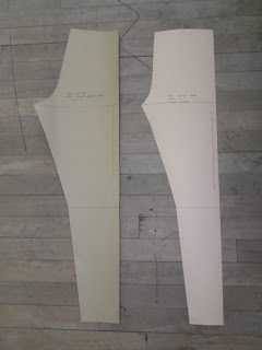
For the last week I have been creating my leggings block for my manufacturing brief as I didn't want to use a trouser pattern. I found this process quite simple following instructions from a Winnie Aldrich book. After I had created that I could move onto patterning and simply traced around the blocks attached the front and back together removing the side seam and drawing 1cm seam allowance and that was my pattern done. I had to use 1cm seam allowance as I am working with stretch fabric so over locking the seams together. If you ever struggle to find a good pattern cutting book I recommend Winnie Aldrich it's simple to follow and has everything in it.

Friday, 18 November 2011

DESIGN FOR LEONA LEWIS...

Hi I was just wondering if anyone would vote for me to design for Leona Lewis I would highly appreciate it.
The link is:
http://tlnt.at/rAQnZA
Thanks

Monday, 14 November 2011

LYCRA SAMPLES...

At first I found it quite difficult to find Lycra samples but then I started to come across companies that specialise in Lycra production and requested a sample. They all range in price but the ones I like are the most expensive so I will have to purchase a cheaper Lycra to Toile my garment in. The best company was Borovick fabrics as they sent me a selection of different widths so I had a varied choice. Most of them were in a flesh colour so it is visible up close but far way it's barely noticeable.


Which one do you think I should choose?

SAMPLING ON LYCRA...

After collecting my own personal collection of Lycra samples I thought it would be a good idea to start sample the PVC onto the Lycra to see which was the least challenging to work with. I found that the thicker Lycra was easiest to work with whereas the mesh was a little bit to hard to handle under the machine and folded over and turned up. I thought the non mesh types were the best and would definitely be using one of the plainer Lycras to create my leggings block.


Which one is your favourite?

TROUSERS 2 - SAMPLING...

Last week I started to sample different PVC types with different sewing techniques to see which one would work the best. I thought that my fabric choice could be interesting with the use of PVC on Lycra so I machined stitched and hand sewed different widths of PVC together to see which I would like to use for the final garment. I felt that the medium weights of PVC worked the best as they defined shape whilst still being manageable with sewing. Also the organic silk gave an interesting texture contrasting to the shiny surface of the PVC, so i might consider using this for my final design. I also had an idea to sew teeth of zips into the seams and felt that this sample worked out quite nice and would look better in a larger scale.


Which do you prefer?

Thursday, 10 November 2011

TOBIE GIDDIO...

This illustrator uses specialised media of Sumi Ink and Pantone films which creates the fusion of digital and wet media to give off a pixelated effect on the lines showing hesitation. The mood of her work is usually quite upbeat and energetic using an outburst of vibrant colours mixed in with monochrome shades creating a block pattern. Her style of work is quite condensed and small scale but he elongates his figures and makes them child like looking with scribbled, sketchy lines and primary colours. The market level of this illustrator would be suited for Couture due to the elongated silhouettes and awkward poses. I am attracted to her work as it is striking and is so simple but effective still allowing the audience to use their imagination whilst understanding what she is trying to get across.

Tobie Giddio inspires my illustrative eye, as her illustrations are free and innovative using a lot of colour and thick brush strokes. With her ideas she focuses more on the form of the garment than the facial features of the model, which I think, works really effectively with the thicker outline still allowing it to be part of the composition. I think I will start to experiment with the use of colours on photo shop and illustrator and scanning in watercolour markings and shapes and providing them with a professional finish on a digital media. I could also use collage and layer different wet media to gain that contrast in texture. She has been highly inspired by Alexander McQueen using similar structures in her illustrations as he does in his designs. Her work reminds me of the 60s era with optical illusion references and block colours in repetitive patterns providing a wide range of colours. She also incorporates nature into her design but makes them more apparent and defined with thick bold lines and blocks of colour.

JEAN PIERRE BRAVAGANZA...

This Illustrator uses a mechanical pencil and white a4 paper mixed with a range of digital media conforming proportion to be slightly unbalanced within his figures. The mood of his work is quite eerie with the disturbing figures and contrast of values used contrasting to the mood of what Yohji Yamamoto create in his work. His style of work is quite characterised and cartoonist with the disproportionate fashion figures using solidified lines and pure colours. My opinion of this work is that it is a style I would like to use to convey my ideas as it offers a chance to create an identity which isn’t usually found in illustration and allows the design to stand out with the striking poses. The suitable market level would be for Ready to Wear, Couture with the use of clean lines and motion within the illustration.
I am inspired by his work, as it is different for the reason being that the proportions of the human form are inaccurate which make his compositions look effective. I also like how he sees the human form making the audience use their imagination to understand what target customer he is aiming his garments at and what story is behind his characters.
I would experiment with similar medias of pencil and incorporate aspects of digital media and fine liner outlining the silhouettes and creating external shapes th
at coincide with his designs. Jean- Pierre Braganza has been inspired mostly by the human form and experiments with multiple shapes and pattern cutting methods to express every possibility. He uses a lot of black and organic fabrics in his design, which is evident in his illustrations bringing through parts of his garment design into his illustrative designs.