Thursday, 10 November 2011

TOBIE GIDDIO...

This illustrator uses specialised media of Sumi Ink and Pantone films which creates the fusion of digital and wet media to give off a pixelated effect on the lines showing hesitation. The mood of her work is usually quite upbeat and energetic using an outburst of vibrant colours mixed in with monochrome shades creating a block pattern. Her style of work is quite condensed and small scale but he elongates his figures and makes them child like looking with scribbled, sketchy lines and primary colours. The market level of this illustrator would be suited for Couture due to the elongated silhouettes and awkward poses. I am attracted to her work as it is striking and is so simple but effective still allowing the audience to use their imagination whilst understanding what she is trying to get across.

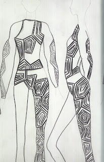
Tobie Giddio inspires my illustrative eye, as her illustrations are free and innovative using a lot of colour and thick brush strokes. With her ideas she focuses more on the form of the garment than the facial features of the model, which I think, works really effectively with the thicker outline still allowing it to be part of the composition. I think I will start to experiment with the use of colours on photo shop and illustrator and scanning in watercolour markings and shapes and providing them with a professional finish on a digital media. I could also use collage and layer different wet media to gain that contrast in texture. She has been highly inspired by Alexander McQueen using similar structures in her illustrations as he does in his designs. Her work reminds me of the 60s era with optical illusion references and block colours in repetitive patterns providing a wide range of colours. She also incorporates nature into her design but makes them more apparent and defined with thick bold lines and blocks of colour.

JEAN PIERRE BRAVAGANZA...

This Illustrator uses a mechanical pencil and white a4 paper mixed with a range of digital media conforming proportion to be slightly unbalanced within his figures. The mood of his work is quite eerie with the disturbing figures and contrast of values used contrasting to the mood of what Yohji Yamamoto create in his work. His style of work is quite characterised and cartoonist with the disproportionate fashion figures using solidified lines and pure colours. My opinion of this work is that it is a style I would like to use to convey my ideas as it offers a chance to create an identity which isn’t usually found in illustration and allows the design to stand out with the striking poses. The suitable market level would be for Ready to Wear, Couture with the use of clean lines and motion within the illustration.
I am inspired by his work, as it is different for the reason being that the proportions of the human form are inaccurate which make his compositions look effective. I also like how he sees the human form making the audience use their imagination to understand what target customer he is aiming his garments at and what story is behind his characters.
I would experiment with similar medias of pencil and incorporate aspects of digital media and fine liner outlining the silhouettes and creating external shapes th
at coincide with his designs. Jean- Pierre Braganza has been inspired mostly by the human form and experiments with multiple shapes and pattern cutting methods to express every possibility. He uses a lot of black and organic fabrics in his design, which is evident in his illustrations bringing through parts of his garment design into his illustrative designs.


PUTTING MY WAIST BAND ON MY 70S STYLED TROUSERS...

After completing the construction of my stripey trousers it was time for the waist band to finally go on the trousers. I thought I would insert piping into the top layer of it to maintain the theme of highlighting seam lines and it surprisingly worked effectively. I then had to hand sew a hook and eye onto the opening of the trousers and hem the trouser legs making sure they were level. Now I can safely say I have completed my own trousers that I have designed myself!
They are now ready to be photographed.

A FEW OF MY ILLUSTRATIONS SO FAR...

You might well know by now that I have started a new brief- Fashion Visualisation which is based on the research of historical and contemporary illustrators. So far I have done sketches inspired by Yohji Yamamoto and Jean- Pierre Bravaganza trying to incorporate their style of work and methods of working into my illustrations. I have found this brief quite hard to get into just for the reason it is drawing which is my weak point so I've got to try a lot harder and push myself. I have used pastel, collage and pencil so far and am certain I will vary the media as much as possible in this brief!

If anyone is out there that wants to give me tips I will appreciate this dearly...

Monday, 7 November 2011

TOILING THE PATTERN FOR MY CHOSEN TROUSER...


For Unit 120 I have to manufacture a trouser design that relates to my chosen brand identity which you now know is Stella McCartney! To gain this pattern on the trouser I started to experiment with fabrics and created a Toile of how the pattern pieces would look and what scale they would be in to fit to a size 12 model. I pinned all the pieces together as close as I could in moderation to the design and think this pieces can be now used to create my patterns using another method of pattern cutting. I think this gives me an idea of what pieces go with each other and how far apart and how they over lap. This is my guide as I can refer back to these pieces if I get stuck whilst manufacturing.


Wednesday, 2 November 2011

CAPSULE COLLECTION DESIGNS...

The final task of this brief was to design a capsule collection for a designer that believed in sustainable methods. I got the tasks of designing for Stella McCartney so had to make sure it suited the target customer of her brand and incorporate inspiration and my own trends within the design. It was quite difficult to design with restrictions as you had to make sure it would identify her brand identity whilst remaining creative within your designs. I had a colour scheme similar to what she would have in an autumn/ winter collection with a few garments that were more vibrant to bring the collection to life. I had to include tailoring, knit and office wear as this is the main target customer for her clothes. In these designs I used similar prints but changed the repeat of the pattern or silhouette so it fitted in with my trends making it more individual to me as a designer. Overall, I think this brief has gone really well and I have managed to complete the tasks with meeting the deadlines and think I have produced some strong designs to take through to the manufacturing brief.

Which one is your favourite?