 I have collected many different images and samples of innovative packaging to help my along the designing process. I looked at all sorts from food to mailing packaging to get some inspiration to present my product. I liked all the irregular shapes used with an unbalance composition and structured element to the creation. This has inspired my ideas making me think of what shapes I could use to create an innovative packaged product that my customer would like and be attracted to. This research has benefited me giving me techniques and methods in which I can display my product in an appropriate way for my customer. I could create different sizes to see which works best as they have done with the cake packaging in this image very small and cute using pastel colours making people buy it for the size and appearance.
Tuesday, 8 March 2011
WHERE DO THEY GET THEIR IDEAS FROM?
I have collected many different images and samples of innovative packaging to help my along the designing process. I looked at all sorts from food to mailing packaging to get some inspiration to present my product. I liked all the irregular shapes used with an unbalance composition and structured element to the creation. This has inspired my ideas making me think of what shapes I could use to create an innovative packaged product that my customer would like and be attracted to. This research has benefited me giving me techniques and methods in which I can display my product in an appropriate way for my customer. I could create different sizes to see which works best as they have done with the cake packaging in this image very small and cute using pastel colours making people buy it for the size and appearance.DON'T YOU JUST LOVE MULBERRY...

Recently, I have been researching into innovative packaging and came across the latest design for London Fashion Week which was promoting Mulberry's brand. I like how they combined child like elements to the design and set for the event but presented such a casual and elegant collection. I thought the fortune teller idea was very creative reminiscing with childhood memories but making it up market and look appealing to all guests. I attempted my own with newspaper as I like all the colour contrasting and tried it in smaller sizes in case I wanted to develop it further in my designs. I think I would consider this idea for my future designing as I feel it could appeal to any customer fitting my profile. for my product.
YOU CAN'T BEAT A BIT OF FRINGE

After blogging about inspiration from Mulberry I realised I missed something out about fringing. I had taken this idea form a garment seen in one of the adverts that Mulberry had done and thought it would look really nice if I recreated it on a bag. I used both fabric and paper to see the difference in movement and which suited the market level in which Mulberry was at. Both worked wonders and looked effective but the fabric sample suited a ready to wear market level and obtained a nice texture. I could possibly use this sample if I was given lingerie to create a feminine movement in the packaging and look elegant on a advertisement. I tried two different thicknesses and preferred the thinner thickness as it provided more shape and volume and was closest to the one in the advert. Do you think I should use this technique in my design? You might prefer a different idea I've got planned!
RECREATING NETS FROM PRIMARY RESEARCH
To start my packaging off I traced around different shaped nets of packaging and recreated the bags and boxes. I found this very easy so I started playing with different dimensions to gain different size that differed from the original size.
LUSH
I used a similar material as they have with the bag using the idea of recycled paper created from a paper advertising their products. I was happy with the outcome of the wider bag as it was neater and would be ideal to hold a larger quantity in. The taller shape wasn't very successful as it was an awkward shape to work with and didn't leave much space to place anything and make. It wouldn't hold itself and balance because it was uneven on both sides so it wouldn't be ideal for anything or it could get damaged or lost. I would develop the wider bag adding colour inspired by the product I would be given and add cording for the handles and base my design around a similar shape for the purpose of it holding a larger consumption. I think I have met the criteria of creating this bag but if I was to advance my skills I would try and find a way of printing the logo with the same font and colour scheme to make it more recognisable.

LG
For these samples I tried to take the aspect of 3d from the advert and create it using cardboard. It worked quite nicely even though the sample with the holes cut out was more effective and could have looked more appealing if I layered different colours and textures underneath as seen in this advert. Both these techniques worked in separate ways but both could have been improved with introducing colours and different patterns, shapes and layers.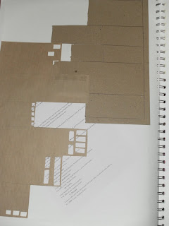
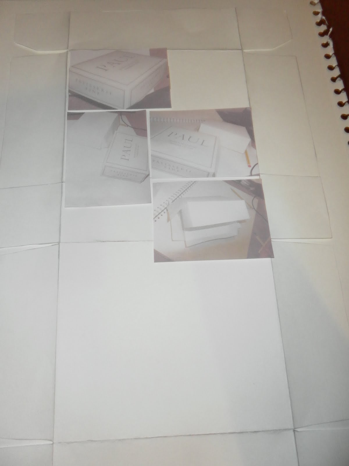
PAUL
In this creation I traced around the net to get a better idea of how to create a box and understand with different shapes and amounts. I benefited from doing this to make me change things from a 2d to a 3d format and extend my knowledge of creating packaging for my future designing process. It worked really well and would consider using a similar size but changing the shape to suit my product. I could have improved by adding a neutral colour palette and some text to make it look more professional but obviously I'll do that for my designs.

COSTA
For this I Similarly traced off the net and estimated where the curved went to as I didn't traced off them and managed to make it 3 dimensional like the Costa packaging. I like this packaging idea I thought it was fairly innovative for a takeaway choice and look appealing. I would use this shape if I was given an small interesting product. I would develop this by adding a logo and some text and use the exact colour scheme used in this packaging.

LUSH
I used a similar material as they have with the bag using the idea of recycled paper created from a paper advertising their products. I was happy with the outcome of the wider bag as it was neater and would be ideal to hold a larger quantity in. The taller shape wasn't very successful as it was an awkward shape to work with and didn't leave much space to place anything and make. It wouldn't hold itself and balance because it was uneven on both sides so it wouldn't be ideal for anything or it could get damaged or lost. I would develop the wider bag adding colour inspired by the product I would be given and add cording for the handles and base my design around a similar shape for the purpose of it holding a larger consumption. I think I have met the criteria of creating this bag but if I was to advance my skills I would try and find a way of printing the logo with the same font and colour scheme to make it more recognisable.


LG
For these samples I tried to take the aspect of 3d from the advert and create it using cardboard. It worked quite nicely even though the sample with the holes cut out was more effective and could have looked more appealing if I layered different colours and textures underneath as seen in this advert. Both these techniques worked in separate ways but both could have been improved with introducing colours and different patterns, shapes and layers.

PAUL
In this creation I traced around the net to get a better idea of how to create a box and understand with different shapes and amounts. I benefited from doing this to make me change things from a 2d to a 3d format and extend my knowledge of creating packaging for my future designing process. It worked really well and would consider using a similar size but changing the shape to suit my product. I could have improved by adding a neutral colour palette and some text to make it look more professional but obviously I'll do that for my designs.
COSTA
For this I Similarly traced off the net and estimated where the curved went to as I didn't traced off them and managed to make it 3 dimensional like the Costa packaging. I like this packaging idea I thought it was fairly innovative for a takeaway choice and look appealing. I would use this shape if I was given an small interesting product. I would develop this by adding a logo and some text and use the exact colour scheme used in this packaging.

Sunday, 6 March 2011
FINALLY CONQUERED THE ART OF PHOTOSHOP
WORKING MY WAY UP IN THE TECHNICAL DEPARTMENT...
After attempting recreating my advertisements with different medias of collage and photographs I had to master using photo shop to challenge myself and ability to produce a professional finish. I recreated the products and extracted logos and colour schemes from the original adverts to combine both elements of their work and my work.
Compared to the first attempt I think I have managed to improve the overall presentation of the font and graphics used in the advert. It took me a while to erase the back ground whilst copying the font from the web version of the advert but then I realised there was a tool to serve that purpose. I think I have managed to set the same message and suit it at a similar target audience with the bright colour scheme and bold font used in the advertisement.
All I did for this attempt was insert font as I extracted it from another advert to get the exact font style and size used to represent the brand. I erased the background so it would have my background behind it and I think it has worked out very well. Now all I need to do is use an older model to suit the specified target audience. I thought if I use a younger model it would create a message that children dress up in older clothes to appear more grown up.

This was a new attempt that I hadn't tried before because the only way that I could create it was to use photo shop. The first step was to photograph toothpaste boxes so I used Aquafresh but layered the Beverly hills formula logo on top to disguise the underneath. I used light shades of blue and white which are symbolic to toothpaste brands. I should have taken an image of the boxes angled in the same way as the boxes at the bottom of this attempt so if I were to try it again I would consider photographing it identical to the way they have in their adverts. The images at the bottom were taken from google and minimised and repeated using different flavours as they do in the original advert.I think this has be aimed at a similar target audience of an older consumer using calming colours and advance technical language on the packaging and engaging context interacting with the audience. In their advertisements they use methods of accumulation and repetition with the products used and use rhetorical question to allow the audience to respond.From the design of the packaging it suits a ready to wear/ couture market level as they have put a lot of thought into the wording and detailing of the shapes and patterns using scientific language competing with the other brands in the same industry.
After attempting recreating my advertisements with different medias of collage and photographs I had to master using photo shop to challenge myself and ability to produce a professional finish. I recreated the products and extracted logos and colour schemes from the original adverts to combine both elements of their work and my work.

Compared to the first attempt I think I have managed to improve the overall presentation of the font and graphics used in the advert. It took me a while to erase the back ground whilst copying the font from the web version of the advert but then I realised there was a tool to serve that purpose. I think I have managed to set the same message and suit it at a similar target audience with the bright colour scheme and bold font used in the advertisement.

All I did for this attempt was insert font as I extracted it from another advert to get the exact font style and size used to represent the brand. I erased the background so it would have my background behind it and I think it has worked out very well. Now all I need to do is use an older model to suit the specified target audience. I thought if I use a younger model it would create a message that children dress up in older clothes to appear more grown up.

This was a new attempt that I hadn't tried before because the only way that I could create it was to use photo shop. The first step was to photograph toothpaste boxes so I used Aquafresh but layered the Beverly hills formula logo on top to disguise the underneath. I used light shades of blue and white which are symbolic to toothpaste brands. I should have taken an image of the boxes angled in the same way as the boxes at the bottom of this attempt so if I were to try it again I would consider photographing it identical to the way they have in their adverts. The images at the bottom were taken from google and minimised and repeated using different flavours as they do in the original advert.I think this has be aimed at a similar target audience of an older consumer using calming colours and advance technical language on the packaging and engaging context interacting with the audience. In their advertisements they use methods of accumulation and repetition with the products used and use rhetorical question to allow the audience to respond.From the design of the packaging it suits a ready to wear/ couture market level as they have put a lot of thought into the wording and detailing of the shapes and patterns using scientific language competing with the other brands in the same industry.
Wednesday, 2 March 2011
CREATING A DRESS BLOCK

When I got handed the worksheet to create a dress block from scratch I thought it was going to be really hard but I managed to understand the steps quite well and the final outcome has come out successful.The worksheet was divided into three separate parts which I found helpful as it allowed me to focus on each individual step instead of panicking at all the steps together.We are used to constructing skirts and bodices so to work with a bigger block is more challenging but its nice to have a change and develop my knowledge for further designing.
THE LIFE OF THE 32 A BRA


For my new brief we have to advertise a product and I have been given a red and cream bra which I am happy with as I can produce a diverse range of designs and innovative packing to aim this product at different ages because a small bra size isn't necessarily aimed at a young audience.
Ideal Customer
Target audience?
Can vary from a young target audience to a mature target audience but must be old enough to suit a provocative style of product.
What car do they have?
If it's a young person they might not drive but if it's someone who is more mature they could drive a average car like a Vauxhall or could drive a top of the range vehicle such as a Range Rover.
What job do they have?
They could be a student either in high school, college or university and could possibly work in any profession but because of the high street label it would be a normal job like a retail's assistant, teacher, model or hairdresser.
What age are they?
For a younger person it would be aimed at 14-20 years as younger people might choose it to seem more mature and appeal older and mature women would be 30-40 years but it could be older.
Where do they live?
They would live in a standard size house or a small house due to the wage they are paid for their profession.
What lifestyle do they have?
They could be either chilled and relaxed meeting with friends and family and socialising or if they were younger they could be out clubbing or partying.
Physical Appearance?
I think their style would consist of provocative clothing or quite feminine with a slim figure and small chest.
Gender?
This would only suit a female gender with a girly personality or intent to look older and appeal more sexy.
Do they have children?
They could have children or they could be a child themselves if they were reaching a teenage age.
What music do they listen to?
Due to the warm colour of the bra I think they would listen to positive music like dance or pop music with the bright colour scheme used.
What food do they eat?
From the colours used I would predict they like hot and spicy food but they could like any food but it would would be aimed at a high street market level so food places like KFC, McDonald's and Burger King. They can also dine at local Chinese, Indians and Thai restaurants.
What drinks do they drink?
I think the perfect person for this product would either live a normal life drinking tea and coffee and having the occasional drink at a local pub but then the other target audience this product could attract for a partying lifestyle could drinks alcoholic drinks regularly.
Where do they go on holiday?
From the colours used in the bra I would predict they would go somewhere hot and populated by tourists.
Where do they socialise?
They could socialise in pubs, clubs, work,friends and family both different lifestyles of the older and younger.
Subscribe to:
Posts (Atom)