LUSH
I used a similar material as they have with the bag using the idea of recycled paper created from a paper advertising their products. I was happy with the outcome of the wider bag as it was neater and would be ideal to hold a larger quantity in. The taller shape wasn't very successful as it was an awkward shape to work with and didn't leave much space to place anything and make. It wouldn't hold itself and balance because it was uneven on both sides so it wouldn't be ideal for anything or it could get damaged or lost. I would develop the wider bag adding colour inspired by the product I would be given and add cording for the handles and base my design around a similar shape for the purpose of it holding a larger consumption. I think I have met the criteria of creating this bag but if I was to advance my skills I would try and find a way of printing the logo with the same font and colour scheme to make it more recognisable.


LG
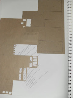
For these samples I tried to take the aspect of 3d from the advert and create it using cardboard. It worked quite nicely even though the sample with the holes cut out was more effective and could have looked more appealing if I layered different colours and textures underneath as seen in this advert. Both these techniques worked in separate ways but both could have been improved with introducing colours and different patterns, shapes and layers.

PAUL
In this creation I traced around the net to get a better idea of how to create a box and understand with different shapes and amounts. I benefited from doing this to make me change things from a 2d to a 3d format and extend my knowledge of creating packaging for my future designing process. It worked really well and would consider using a similar size but changing the shape to suit my product. I could have improved by adding a neutral colour palette and some text to make it look more professional but obviously I'll do that for my designs.

COSTA
For this I Similarly traced off the net and estimated where the curved went to as I didn't traced off them and managed to make it 3 dimensional like the Costa packaging. I like this packaging idea I thought it was fairly innovative for a takeaway choice and look appealing. I would use this shape if I was given an small interesting product. I would develop this by adding a logo and some text and use the exact colour scheme used in this packaging.

No comments:
Post a Comment