 MAX FACTOR
In this attempt I used a photograph and collaged the font on top of the products trying to create layers similar to the advert.Compared to this advert I think my attempt is similar but could be improved by using photo shop to insert the text to make it look more professional to suit a high street market level and young target audience.Overall I have found similar colours and used the same positions and shapes so I think I have replicated this advert very well for my first attempt. Do you have any thoughts or ideas how I could improve?
MULBERRY
In this attempt I thought that the overall image was too challenging to replicate so I extracted the colour scheme to use for future reference in case I wanted to use it for my advertising campaign or packaging idea. In my opinion I think the colours are fairly accurate but to improve I could have zoomed in to different sections of the photograph and replicate either the design or structure of the garments to change into a 2d or 3d format.
 In this simplistic image I attempted to replicate this advert as it was easier to reproduce. Overall I am happy with the outcome but I bet your all wondering that she looks nothing like the model but it was the closest I could get to this advert.I tried to find accessories and garments that I owned that could create a similar image and they worked well together but I could have edited this original photograph in photo shop to make it look similar to the model.

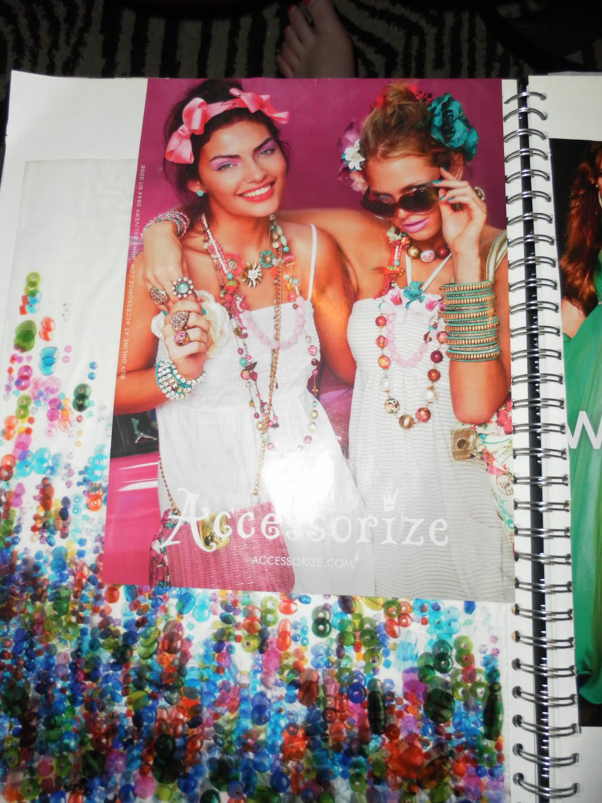
ACCESSORIZE
In this attempt I think I have made a good effort to recreate this advert using the same colours, shapes and patterns and allowed my sister and her friend to pose in a similar manner to the model's in this advert. I could improve by analysing the advert closely and using the exact colour scheme to make it look similar and use older models or edited it in photo shop to make it look more professional.
 JEAN PAUL GAULTIER
In this attempt I took a photo graph and edited it in photo shop and found it rather difficult to get the right contrast and tone in the background and after so much effort I still didn't get a precise colour but got a close attempt. I added more detail on top of the photo graph of the logo and perfume bottle to give it a 3 dimensional look by collaging the exact font to make it look more like the MADAME advert.


 What do you think about these outcomes or do you think they could be improved?
No comments:
Post a Comment