Tuesday, 19 April 2011

CARLOS APONTE...

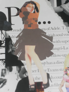
During the research period of this brief I have managed to stumble across quite a few appropriate illustrators that link in with my chosen theme of working class. Carlos Aponte's work is create by using the media of tape on board free drawing the shapes to envisage a designer's collection working to promote brands such as: Christian Dior and Paul Smith displaying their flamboyant visionaries. I attempted his technique using similar materials such as PVC Electrical tape inverting the colour scheme of his to black on white paper making the design stand out clearly. The first attempt was of design 6 outlining half of the dress making it more abstract using an empowering colour but simplistic textural influences.

This attempt was a larger scale of design 3 and I didn't like the brown background because it didn't obtain the sharp contrast I wanted unlike the bottom attempt which was really successful and I think it turned out the best so I am pleased with my final result and would consider using this style on either my illustration or design board.


Another attempt was made by using design 2 as the muse highlighting the outline of the shape with tape and emphasising the texture and material by the accumulation layering and folding over to create creases. I think attempt worked really well and enough though it was a rough drawing turned out to appear professional.

Saturday, 16 April 2011

MAREN ESDAR..

Another illustrator I researched into was Maren Esdar as she linked in within my theme using distorted images of models facial features and designs drawn to a smaller scale to promote her findings and ideas. I thought it would be really difficult but the help of photo shop I manged to create some of my designs with her method of technique. I think these worked out quite well but I don't think they would display my theme professionally on my design board so I'm glad I have attempted work like his but I don't think it will show off my design in a suitable manner.


SOPHIE TOULOUSE..

I have been researching into different illustrators that can relate to my theme and cam across Sophie Toulouse that I have heard of from a previous brief but never looked into her enough to no her inspirations and background. I think she links in with my theme because of her uncertain lines the outline the shapes and bold colour scheme using a lot of negative space showing the emotions shared between a working class society. I recreated one of her illustrations to see if I liked the way she presented the work and how I could cope with the technique and using similar media of watercolours and inks and I think I would definitely consider using her technical inspiration for my design board.


SPLASH OF COLOUR...

My colour scheme represents the working class using: browns, red, beige's, black, white using a selection of shades within this colour scheme. From these images I picked out the relevant colours taking inspiration from images that I felt strongly about.From these images they provided an eerie mood and atmosphere so I wanted to take these elements through from the colours because working class is quite a depressing and emotional subject to display. I think all these images go well together as I have chosen the lighter shades of what I originally placed on my mood board because I think it relates to my chosen theme more accurately.


JEALOUS OF THE KNITTED BAG...


My aunty visited us today with our Easter eggs and my sister had her especially presented in a knitted bag but not me! I was a little bit disappointed but I'll get over it. I just thought you know fashion student, loves making clothes and she chooses my sister to spoil. I had to include my Easter I didn't want to leave it out so I placed it in the bag and took a picture!

LAST BRIEF OF THE FIRST COLLEGE YEAR: MATERIALS , TECHNIQUES AND PROCESSES.

Finally we have nearly reached the end of the college year preparing to construct a garment for the college fashion show. In this brief we have to research into illustrators and choose which ones will fit in with the style of our theme. This means I should look out for sketchy, uneven, rough lines and quite graphic imagery that has a unique style and look as it best sums up WORKING CLASS. It's quite daunting that in 2 months time I'll have a garment going down the runway hopefully it will have an impact and be successful but I need to do the researching before I get onto that part of the design cycle. This brief sounds quite challenging for me because I am fairly weak at drawing and not very confident with the way I illustrate things but all I can do is try and hopefully I will improve with the practise of this brief. You'll just to wait and find out if I'm successful and I will definitely keep you updated to know how my dress will look in 2 months time.

Tuesday, 12 April 2011

EDITING MY FINAL PICTURES...


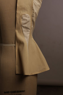
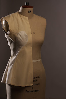
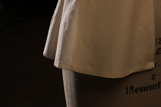
As you can see from the previous post the threads were spoiling the image so I have managed to learn how to edit the creases and threads out that make the image ugly but to look more professional.These work so much better minus the threads and I feel that my garment has been displayed to it's full potential and proud of what I have accomplished throughout the past few weeks.