Monday, 31 January 2011
HAND EMBROIDERY
TASSELS
How can I describe TASSELS.. harder than you think!
I thought this workshop would be the easiest but it takes a lot of patience to position the materials in a secure place. I attempted the same technique with different medias of thread, cord, lace,wool,elastic,ribbon to fuse different colours and textures together to see which ones worked the best. Out of all these samples I prefer the tassels using neutral colours as they are more subtle and complement each other. If I were to incorporate this technique in my design I would consider making them larger and longer and make them neater.I experimented a lot with thickness and colours but didn't change the length in the individual threads to see what effect they would produce.
Saturday, 29 January 2011
KNITTING
I found this technique the most challenging so far! It's one of them things where starting is an issue but once you get the hang of it you find it easy. My first attempt at knitting went awfully wrong with the needles being too big and not pulling tight enough so it was loose and hard to find the loops Then I tried again with different materials which was also difficult because they all had different properties to handle with. I decided to do more length than width but if I were to attempt it I would do smaller wider samples to see the difference. If I were to improve on my knitting technique I would pull tighter and try not to drop stitches. If I were to improve my technique I would consider it in my designs but I don't think it will be appropiate if I'm not the strongest at it or else the outcome could be awful.
Friday, 28 January 2011
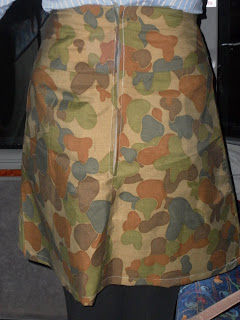
SLIGHTY FLARED SKIRT WITH A YOKE
MANUFACTURE PLAN TO CREATE A SLIGHTLY FLARED SKIRT WITH A YOKE.
1. Over lock the bottom of the front yoke.
2. Over lock the yoke line of the top of the front skirt.
3. Placing the two right sides of the fabric together matching the nick in the centre of the fabric. Sew a 1.5cm seam allowance of the centre of the garment to the side seam.
4. Turn the garment over and repeat the process from the centre of the garment to the edge of the side seam.
5. Press the seam open.
6. Over lock the bottom of the back yoke.
7. Over lock the yoke line of the top of the back skirt.
8. Attach the back yoke to the back skirt (x2) using 1.5cm seam allowance. Press open.
9. Over lock CB (x2) join backs (x2) together using a 1.5cm seam allowance.
10. Insert zip into back seam.
11. Attach the front and back skirts together using 1.5cm closed seam.
12. Iron interfacing to front and back facings.
13. Attach front and back facing together using 1.5cm seam allowance.
14. Press side seams open.
15. Over lock facing.
16. Over lock the facing along the back edge and bottom facing.
17. Attach the facing to the skirt matching centre and side seams with a 1.5cm seam allowance.
18. At the edge by the zip turn excess material back.
19. Press the seam allowance towards the facing.
20. Sew a retaining stitch.
21. Sew the facing down following the machine lines from the zips.
22. Over lock the bottom of the skirt and turn up hem line to 2cm and then stitch a 1.5cm top stitch.
Wednesday, 26 January 2011
APPLIQUE/ REVERSAPPLIQUE
APPLIQUE
The next workshop I attempted was APPLIQUE where we had to choose a pattern from observational studies, magazines or previous research and convert it to a textile pattern.The important steps to create a succesfull applique sample is to:
1.Extract the pattern and draw it larger scale.
2. Cut Bondaweb to the dimensions needed to fit the pattern onto.
3. Iron onto fabric.
4. Trace off pattern and cut around the outline.
5. Peel off the paper leaving the glue on the other side to then iron onto the base fabric.
6. Set up a domestic machine changing the stitch to zig zag stitch to then alter the tension and stitch length to then sew along the outside of the pattern in a similar colour scheme to the fabric used.
REVERSAPPLIQUE
1. Layer the amount needed to create your piece on top of each other.
2. Pin or trace around shapes to then sew a running stitch arounf the outline. 3. Cut the top layer to reveal the underneath pattern.
4. Change the stitch to zig zag and sew around the outside.
5. Pull both thread left and tie at the back.
I will definately consider using these techniques in my designs as it's fairly simple and can create contrasts in colour, thickness, pattern.I feel I have chosen a simplistic pattern and could develop it further and work into individual sections of some of my research to make the deatil more complex.I am pleased with the final result of my applique and reapplique samples as the pattern came out how I imagined contrasting from other juxtaposition colours.
LARRY SCHWARM
I thought I would be different and research outside the textile genre and expand my research to photographers and I cam across LARRY SCHWARM, which uses concepts involving natural disasters and captures the devastating mood and atmosphere from the composition of household items overlapping and trapping various materials creating different shapes and patterns.Realistic situations are revealed from the use of smashed ceramics, isolated bricks and splintered wood making the environment dangerous and the public at risk. I know natural disasters are an absolute nightmare and cause such dreadful outcomes but this is a way of bringing out the good into an art form.The colour scheme is quite neutral with browns, greys, blues which I could incorporate into my designs as I like all the shades and tones created from similiar colours. His work had influenced my design ideas with the contrasting textures and dynamic change within the shape and pattern structure.What do you think about his work?
CREATIVE?
WEIRD?
DISTURBING?
Saturday, 22 January 2011
CHESHIRE - BORN AND BRED
Obsessed with details, ephemera, memories, and found objects, she grew up on a visual diet of comics and trips to the local antique shop. The facination of man and machine creates a relationship of how she sees technology evolving and how much people depend on it.She often juxtaposes organic and mechanical images to form surreal and whimsical narratives. Butterflies, insects and organisms are also a common theme throughout her work as she draws much of her inspiration from nature and it's rustic colour palette.She shares a similiar style to Salvador Dali with time and age with the use of clocks whereas she uses alternative technological equipment. She also uses scientific faces and figures to suit the concept and make it have a vintage appearance. I appeal to this style of art because it has more meaning and has an interesting appearance with the use of shades and tints placing it in another time period.
CUT IT OUT
After attending sessions in observational drawing I learnt many different techiques of drawing, collaging, embroidery and paper cutting that all relate to surface pattern. I didn't realise at the time but displayed my Alison Willoughby research on a composition Robert Ryan had created and decided to expand my knowledge of his work. I also came across a simliar artist that uses the same technique but enlarges the font size and uses monochromatic colours whereas Ryan incorparates accent primary and secondary colours into his designs highlighting the dominant features. They both express they're thoughts and feelings in various quantities or extract famous cliches and enscript the letters into they're work. They both have a different effect on my mood with Julene Harrison's work putting me in calm mood with the neutral colours whereas Robert Ryan uses intense colours that clash and complement which in my opinion I prefer as it places my mood to a imaginative setting.
ROBERT RYAN
His work consists of paper cuts with whimsical figures standing on mountains made of flowers, of clouds hung from the sky with strings, little birds perched on houses with curly, fantastical roofs. I can see elements of surrealism in some of his designs defeating the negativity that surrounds our lives but replacing it with happy illustrations that make you optimistic.
http://www.misterrob.co.uk/?page_id=39
JULENE HARRISON
Her work is inspired from nature, cityscapes, landscapes, iconic figures
and how she percieves life in general and wants other people to share the experience with her. The messages and quotes are personal to the customer to reminise with past and future memoirs.Many of her typographies feature a capital city with tourist attractions incorprated into the design which I think makes it more realistic.
http://madebyjulene.com/
Friday, 21 January 2011
SEWING MY HOODY TOGETHER
Preparing for the overlocking didn't go according to plan as the overlocking that was used in my hoody was made from a 5 threaded overlocker but we weren't able to find one at the time so the four threader had to do. It didn't really make much difference and still did the same job.
Overlocking the patterns together was harder than I thought as the stretch in the fabric made it challneging to get the two pieces of fabric alligned.
The sleeve was a absoulute nightmare as the pins that held it place had to be place in the centre where a notch was made and alligned all the way round to give ease at the armsyce. Whilst I was overlocking I managed to create a few holes because the material kept on slipping and not sewing evenly.
COLOUR THEORY
TERMINOLOGY
DOMINANT COLOUR -The colour with the largest proportional area.
SUB DOMINANT COLOUR – Colours with a small proportional area but still a main colour.
ACCENT COLOURS - Colours have a small relative area, but offer a contrast because of a variation in hue, intensity, or saturation
MONOCHROMATIC - Uses shades or tints from the same hue.
ANALOGOUS - Any three colours from the same spectrum adjacent to eachother on the colour wheel.
COMPLEMENTARY - Two colors that are the direct opposite of each other on the colour wheel.
VALUE – How intensive or light the colour is.
SATURATION – How pure or full a colour is.
SHADES – A hue produced by the addition of black.
TINTS – A hue produced by the addition of white.
SPLIT COMPLEMENTARY – One from one side of the colour wheel and two from the other side.
TRIADIC – Same distance on the colour wheel to each other.
TEMPERATURE - Color temperate can help enhance the mood of an image.
CONTRAST - Contrast is the noticeable level of difference between two colors.
PRIMARY COLOURS - Primary colors are not mixed from other elements and they generate all other colors.
SECONDARY COLOURS – Colours achieved by a mixture of two primary hues.
TERTIARY – Colours achieved by mixing a primary and secondary hue.
JUXTAPOSITION – Colours side by side that clash or create negativity to create a reaction or vibration.
HOODY CLUB
UNPICKING - FRONT BODICE
BACK BODICE
RIGHT SLEEVE LEFT SLEEVE
BACK HOOD
INSIDE HOODRIBBING- CUFFS AND WAIST
This took a duration of 3 consecutive weeks to unpick every feature of this hoody.I had to make sure that I was careful I didn't rip holes and unpick every seam so the patterns would be accurate to trace off.
TRACING THE PATTERN OFF
FRONT BODICE/ BACK BODICE
Both of the front and back bodice patterns were cut on the fold so I only traced off half of the hoody.
BACK HOOD PATTERN
FABRIC
LINING
PATTERN
I used the same pattern to cut 2 in fabric and lining to make they were all precise and obtained the same shape.In the end I needed cut 4 out of the hood to be able to bag it out in later stages.
The total cost of my fabric was approximateley £7-00 for the fabric, lining and ribbing for about 3 metres in length.The stretchy material I used had fleece properties as it was thicker than cotton but equipped with a strecthy quality.The lining for bagging out my hoody with was cotton with a design that would complement the dominating colour of the charcoal grey used for the hoody. I couldn't find a similar shade to the grey I used for the majority of my hoody so I had to use black which is the best suited.